Who’s been naughty AND nice?

This year I wanted to develop a theme inspired by our pets
as they are so much part of our families, as our human children are. For this
new Christmas ecard, the idea was to inject a bit of fun into the festive
season using three little mischievous kittens.
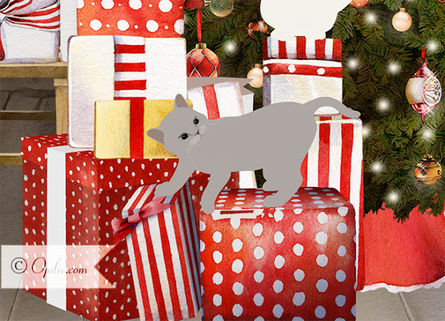
Digital kitten engaging with scanned images of water coloured objects forming a rich background
Anyone who has observed cats and boxes (or even young children and boxes), will have seen how they are always more interested in the box itself, rather than what is inside.  They like to try to find any way possible to get inside a box, no matter how small or impossible it may seem. There are tons of You Tube videos that play testament to that.
This card is a series of vignettes
of three little playful kittens getting into the Christmas presents which kind
of represents the suspense that we all feel when we see the boxes under the
Christmas tree. They create a bit of mayhem as only cheeky furry creatures can, before finding a perfect cozy spot in a box to snuggle and settle in for
Christmas.  I think this embodies the idea of getting warm and comfy for
the holiday season.
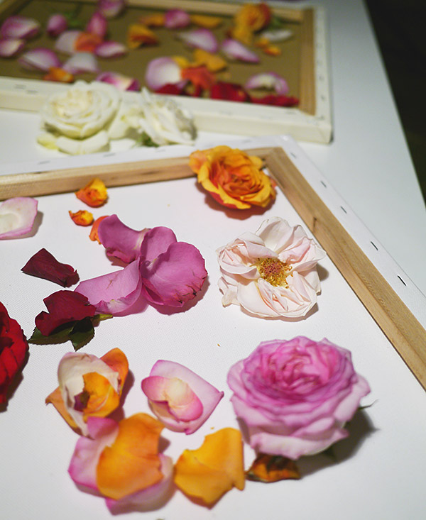
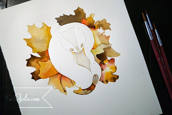
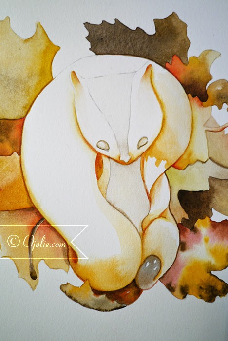
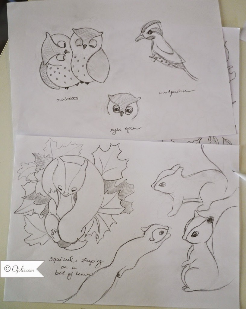
The formation of the card involves different elements, using hand painted objects and animated digital characters. After developing the idea for this card, the basic tale is story-boarded.
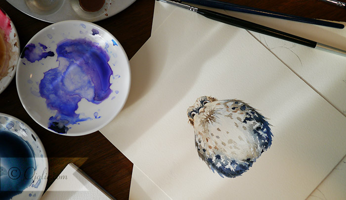
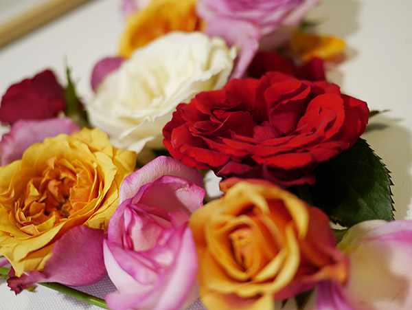
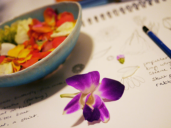
Next, the elements making up the scene, such as the wrapped presents, boxes and a Christmas tree, had to be sketched, painted in water colours then scanned into the computer via Photoshop. The result is a more illustrated feel and look to the overall card.
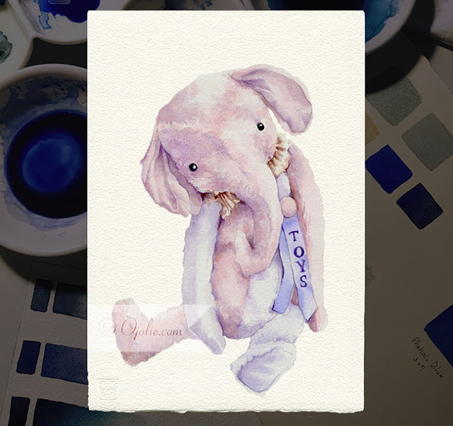
Hand painted water colour stuffed elephant toy prior to being scanned 
The cheeky kittens were rendered and animated using Adobe Flash, but key frames are usually hand sketched first like traditional animation, so you have more control over
plotting the movements of your characters. The sweet kittens stalk, pounce, climb
and jump amongst a flurry of gifts and boxes in a delightfully natural manner. We wanted to capture the naturally curious nature of these playful
cats.
Check out the finished product:  www.ojolie.com/index.php?ec_id=208
Can you relate to this ecard?
I would love you to share your experiences here about how your pets also enjoy Christmas.
Please feel free to post any pics you have of your furry creatures getting into the Christmas spirit and let’s enjoy the inquisitive nature of our darling pets.

Illuminate the World with Peace

I developed two new cards as a response to all the turmoil
going on around the world. We wanted to remind people that despite all the
chaos, we can choose to focus on positivity and resonate this intention out to
all those around us.

Reflecting on the idea of light as a symbol of hope and enlightenment, I decided to combine both the modern concept of lights through illuminated light bulbs, but with a slightly retro touch for a hip graphic designed style.
Ojolie “Illuminate the World” animated e-card for the holidays 

The result is our newest e-card, “Illuminate the World”, set against a starry
evening sky, with light bulbs illuminated with the words: Peace, Hope and Joy, coming
to life to shine brightly with Christmas greetings. 

The world needs a big
injection of these three elements right now. 

The idea for our new Peace Ribbon e-card came from a trip to the store to buy some simple ribbon for presents.  The news from that day was still going through my mind – another day of senseless violence and unrest.  As I sat fiddling with the ribbon between my hands on the ride home I could see the word peace forming.  It was only when I arrived home, I realized I had the first sparks of a card in the making.

I chose  white doves for this e-card as they are
a classic symbol of peace and a candy cane white and red striped ribbon to inject some uplifting holiday spirit.  There is nothing solemn or mellow about this card. The animated doves dance and fly about to an
upbeat tempo whilst holding red ribbons in their beaks, to spell out the word
“Peace” against the backdrop of an earth globe.

Wishing you peace and joy – and that these e-cards bring smiles to the
faces and the hearts of your loved ones all around the world.   

A little bird told me … You are dying to know how it came to life!

Ever curious how a character in Ojolie ecards comes to life – from storyboard to digital canvas?

A very important step that might not seem immediately obvious is actually developing a palette for the card. This is not something I have always done, but with time I have found that this makes the process of developing a cohesive looking card much easier. Plus its actually quite relaxing and fun, not to mention a great way to remember how you mixed a certain favorite color.

 A bright watercolor palette for Autumn

The characters are developed via a set of quick sketches, which allows you to rework them until they are just right. For this card, somewhat unusual, the characters just seemed to flow pretty clearly onto the paper and Even though I only needed a few birds, I had to paint them in a variety of poses to be able to bring them to life as animations. This was the most difficult part and adding a design and details doesn’t make it any easier … but then the characters insisted this was how it had to be.

Character Sketches and illustrations of the little birds

For the little owl, layering was as always my friend, starting with the lighter colors and gradually building up the details and dark shades in the feathers. For all our feathered friends, having a clear palette and sticking to a mix of a few complimentary colors really makes it much easier to get a nice pleasant looking character, even when the coloring of the feathers is a figment of your imagination.

Fluffy little owl

After scanning the paintings and cleaning up the backgrounds on the computer, there are a few other little secrets to bringing them alive, but maybe I will share that another time.

Happy Autumn and Thanksgiving!

Painting with Fresh Roses

The most amazing smell of roses filled my little studio today, as I was ‘painting’ with roses.  Gently prying them apart or manipulating them into an arrangement for the newest card I am working on for Mother’s Day.

After weeks of working late into the night at my easel, painting on canvas, it was incredibly rewarding to work with this new medium.  

A slightly wilting rose is beautiful in a way that is hard to explain – there is an instant patina and texture, it reminds you how fleeting the delicate petals are, yet this is when we finally get to see the hidden beauty at the core.  I wanted to capture this in the arrangement of the petals and buds in the shape of a heart, not the cliche Valentine arrangement in usually brings to mind, but something slightly more ephemeral and imperfectly perfect.  If that makes sense 🙂

I must confess I cannot say that ‘no roses where hurt in the process of making this card’, but there were some lucky survivors that made it into a vase after the shoot.  I collected a nice big bag of petals now waiting in my fridge to be dried using a new method I am going to try in the microwave – later to be used in a painting, which I will post if/when it works out.

Going over the photos from the shoot this evening I was quite pleased with the results.  On to turning all of this into a story with animation …

Follow up Sneak Peak: Character Paintings

It may seem like a long time from sketch to paint, but in between I have been working on a million other things … okay, not a million, but quite a few.  It is the irony of my line of work that we have to think in snowflakes in the middle of summer, but planning is everything.  I think about Christmas all year long and by Christmas I will be planning spring and summer ecards

But I finally got around to painting the characters for the Thanksgiving card and I promised to share an update when I did, so you can see the whole process.

I first paint the leaves and start some slight shading of the squirrel

As you can see, for these I wanted to keep a simple watercolor style, nothing too detailed, to give the card illustration style a relaxed and casual feeling.  I therefore limited my usual layering of primary colors to a minimum and instead just worked with colors premixed on the palette.  Quite relaxing for a change and fast!

Working in some shading and details before the final color washes are applied helps make the character pop

And voila – the first character is done.  You will have to wait until the card is released the see the rest 🙂

Since then, they have been scanned, cleaned up (white background removed) and are now ready to be used in animation.

I also painted a LOT of fall leaves and nuts and the centerpiece, an imaginary tree, that sprouts the leaves of a variety of trees.  If it sounds a bit strange, you will see that it works quite well visually, making for a nice bouquet of a tree.

I love Fall – can you tell?

On to key frame sketches for our little squirrel …

Of Flowers and Georgia O’Keeffe

One of the dearest people in my life is my sister.

I painted this painting for her while I was in Denmark – in fact it came together very spontaneously and fluidly a summer afternoon on the grass in the garden.  When I showed up to her place with it I pretended I just wanted to store it there while traveling to Norway, which gave me an opportunity to see her reaction to the painting before giving it to her.  If she did not seem particularly moved I would have not given it to her, because I wanted her to really love it.  Well, her reaction was better than hoped and I could tell she really liked it even before she knew it was for her.  Needless to say my mission to make it an early birthday present for her was accomplished.

“Ode to O’Keeffe”, Acrylic on Canvass, 80x80cm

This painting was inspired by my love of Georgia O’Keeffe’s paintings of flowers, hence it is titled “Ode to O’Keeffe”, although in many ways it is nothing like the paintings O’Keeffe painted.  For one, most of her flowers really do bear an uncanny resemblance to a certain part of the female anatomy.

Detail of “Ode to O’Keeffe”

When painting with super strong colors, especially reds and pinks, on a larger canvass it is easy get worried mid process that the end result is going to be a too bold or (shock) even crass and tacky.  You have to push past that and allow it to play out, because somehow by the time you put the final details in place things start to finally make sense.  It is hard to explain, but this is where experience and having faith in the artistic vision help – and worst case if the end result is still horrible you chuck it up to experience and the need to experiment.  This is exactly what happened with this painting – while I was working on it I was getting a bit worried about the huge areas of pink and red, but by the time I was painting the little pollen pods, it was all starting to gel quite well.

Texture is really important to me when painting, whether it is watercolor, acrylics or any other medium.  For some pieces you want that absolute smooth finish and perfect gradients, but for this piece it was important to add interest into the big areas of bold color by using texture.  If you have ever observed the surface of flower petals really closely, you will notice many are almost covered with surface of fine hair or powder.  When the light hits at a certain angle it shines and glistens … it is really magical.

A Collection of Amazing Art Tutorials

Thanks to a lot of generous people there is a an amazing availability of art tutorials online.  These are a great way of getting your feet wet if you are new to art or a certain medium or simply looking to challenge yourself if you have some experience already.  Even as an experienced watercolor artist it is interesting to see how other artists work – everyone has a slightly personal way of doing things or has found a particular thing that works in addition to the fact that there are many ways to get good results.

Follow Frederikke Tu’s board An amazing Collection of Art Tutorials on Pinterest.

While you can learn a lot from these tutorials, I do think there is no substitute for learning from others.  This is where taking a class or getting together with a few fellow creative souls will help you learn from each other.   But that said, I have learned most of what I know from books, experimentation and online tutorials.  This way I got a ton out of the few classes I have taken, because I already came prepared with the basics.

Sneak Peak: Character Development for Fall/Thanksgiving Card

Yesterday I started work on developing the characters for this year’s Thanksgiving/Fall production.

The card will have quite a few characters, so this part of the design phase is especially important.  Some will be painted in watercolors, and separated into different body parts after scanning them into the computer.  This way I can keep the watercolor style but still animate the characters.  I have not yet decided whether the squirrel will be hand painted for each frame of animation, or whether I will  render it on the computer, since it will need a full range of motions when jumping.

The main character is the woodpecker, so I started when him first.  Once his character was in place I build the other characters up around him.  I will share more photos as I start painting the various elements of the card …

Water Mixable Oil Colors

This summer I spend about ten days painting in the north of Denmark and trying a new medium for me, water mixable oil paints.  Since I normally paint with mostly watercolors and acrylics this was a real change in pace, as the longer drying times of oil presented a particular challenge while travelling.

But I must say I loved the richness, the vibrant colors of the pigments and the final result of the oil paints.  And being water mixable means there are no nasty fumes to put up with.  So after stocking up on four canvasses and paint in Copenhagen, I set off with my kids for the coast and the little cabin we would spend the next ten days in.

“Flights of Fancy”
Oil on Canvass
by Frederikke Tu

As luck would have it, this July was so hot in Denmark, it was almost unbearable to be outside some days, so I moved the garden furniture inside and made it my painting studio.  Luckily the cabin had lots of glass and it still felt like being outdoors.

Could you imagine a lovelier studio while on the road?  Happy memories …

For the first painting I decided to forgo a grounding layer, which I normally would use with the acrylics, since there was a time constraint.  As you can see from the photos, the paint goes on nice and thin with the water mixable painting medium that is part of the range.  I have since bought a painting paste as well, which is more like the paints in thickness.

I did find that the key was not to use both water and painting medium together, or I would get some tackiness and the paint would not spread easily.  So you either use a little water or you use painting medium, but not both.  I also discovered that the white dries much slower than the other paints, so areas with more white needed more time in between coats.  As you can also see from the photos, the colors start looking really amazing after the second coat, so a second coat really is a must, especially without a grounding layer.

Painting the first coat – a little streaky, which second coat takes care of

I waited a few days between coats and in total this painting took three days to paint, much longer than a similar painting would have taken me with acrylics.  But I think the results are worth it and for many things this medium will still be my new favorite.  I still love acrylics, just for the sheer convenience and speed, but acrylics do lack something in the final feel and touch.  However they gel well with my temperament and allow me to work in my own impatient and frenzied pace.

If you would like to try water mixable oil colors yourself, there are several brands that offer them.  I choose Cobra from Talens.  But enough about the medium, I will let the painting speak for itself!  Let me know what you think.

Fathers Are Just as Important as Mothers

It is easy to forget Father’s Day – it just does not get the same kind of attention that Mother’s Day gets. I know this for a fact – and statistics support it.  I see it every year when far fewer cards are sent on Father’s Day than Mother’s Day. And I don’t believe it is because we as a society do not value to amazing contribution that fathers make in the lives of their families.  I do not know why as a society we are less likely to celebrate fathers than mothers on their special day.  But I would love to hear from you: how do you celebrate the father figures in your life?  And Dads, how do you want to be celebrated?  You can comment here or send me a mail through the website at www.ojolie.com.  Got any special requests for Father’s Day cards for next year?  Tell me now and I will give them full consideration.

Happy Fathers Day   2012
From toonpool.com

In the meantime, I am happy to share this touching video with you, just a reminder for us all in our busy daily lives to take a moment to really connect.  We don’t need a special day to acknowledge the wonderful people in our lives, but sometimes these special days help remind us to do so.

Wishing You a Very Happy Father’s Day this Sunday!