Sparkling New Year

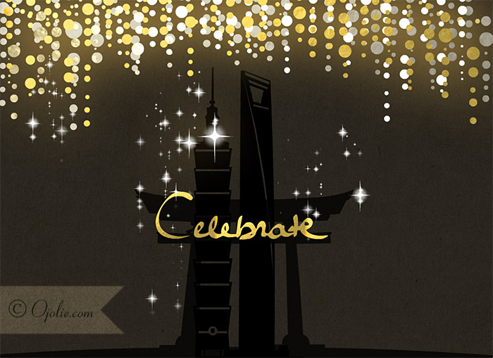
Hand lettered words appear in gold foil

I have celebrated the New Year with family and friends in Asia a few times now. What has delighted me most, given the time differences, is that as I watch and enjoy as the celebrations, they continued around the world after starting in Asia. It is like experiencing one never ending party! The good vibes keep on generating and it has made me realize that this is the one global celebration, where we really are a big global family.

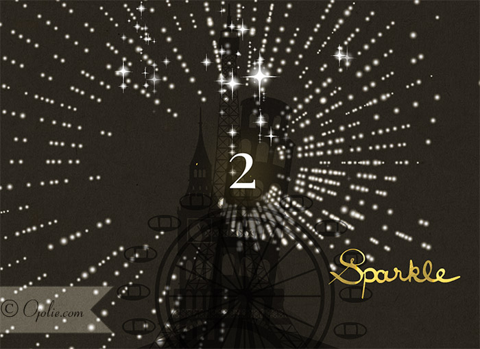
The motif I chose to inform the final card for 2015 features iconic landmarks of the world. There are 21 famous landmarks in this card.

If you feel up to challenging yourself, you can try to see how many can you name and locate. See the card now.

This ecard encompasses New Year celebrations from around the globe complete with a fan fair of fireworks, confetti and radiating light animations choreographed to the countdown, amidst a night sky.

The style is a modern, graphic design, featuring hand lettered words – “celebrate, sparkle, shine and cheers” – and details in gold foil.

The colour palate is classic; black, gold and white. Like effervescent golden bubbles of champagne, sipped upon at a stylish black tie event on New Years Eve.

I hope that where ever you are celebrating the dawning of 2016, it is filled with sparkle and shine.

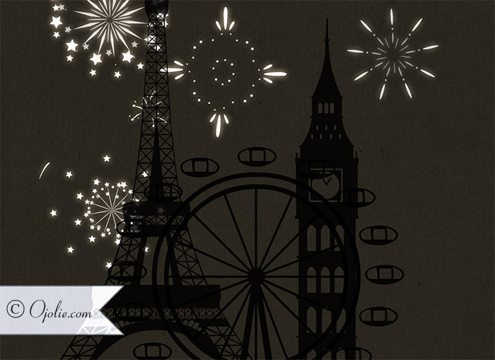
Iridescent fireworks explode around classic icons

Of Flowers and Georgia O’Keeffe

One of the dearest people in my life is my sister.

I painted this painting for her while I was in Denmark – in fact it came together very spontaneously and fluidly a summer afternoon on the grass in the garden.  When I showed up to her place with it I pretended I just wanted to store it there while traveling to Norway, which gave me an opportunity to see her reaction to the painting before giving it to her.  If she did not seem particularly moved I would have not given it to her, because I wanted her to really love it.  Well, her reaction was better than hoped and I could tell she really liked it even before she knew it was for her.  Needless to say my mission to make it an early birthday present for her was accomplished.

“Ode to O’Keeffe”, Acrylic on Canvass, 80x80cm

This painting was inspired by my love of Georgia O’Keeffe’s paintings of flowers, hence it is titled “Ode to O’Keeffe”, although in many ways it is nothing like the paintings O’Keeffe painted.  For one, most of her flowers really do bear an uncanny resemblance to a certain part of the female anatomy.

Detail of “Ode to O’Keeffe”

When painting with super strong colors, especially reds and pinks, on a larger canvass it is easy get worried mid process that the end result is going to be a too bold or (shock) even crass and tacky.  You have to push past that and allow it to play out, because somehow by the time you put the final details in place things start to finally make sense.  It is hard to explain, but this is where experience and having faith in the artistic vision help – and worst case if the end result is still horrible you chuck it up to experience and the need to experiment.  This is exactly what happened with this painting – while I was working on it I was getting a bit worried about the huge areas of pink and red, but by the time I was painting the little pollen pods, it was all starting to gel quite well.

Texture is really important to me when painting, whether it is watercolor, acrylics or any other medium.  For some pieces you want that absolute smooth finish and perfect gradients, but for this piece it was important to add interest into the big areas of bold color by using texture.  If you have ever observed the surface of flower petals really closely, you will notice many are almost covered with surface of fine hair or powder.  When the light hits at a certain angle it shines and glistens … it is really magical.

A Collection of Amazing Art Tutorials

Thanks to a lot of generous people there is a an amazing availability of art tutorials online.  These are a great way of getting your feet wet if you are new to art or a certain medium or simply looking to challenge yourself if you have some experience already.  Even as an experienced watercolor artist it is interesting to see how other artists work – everyone has a slightly personal way of doing things or has found a particular thing that works in addition to the fact that there are many ways to get good results.

Follow Frederikke Tu’s board An amazing Collection of Art Tutorials on Pinterest.

While you can learn a lot from these tutorials, I do think there is no substitute for learning from others.  This is where taking a class or getting together with a few fellow creative souls will help you learn from each other.   But that said, I have learned most of what I know from books, experimentation and online tutorials.  This way I got a ton out of the few classes I have taken, because I already came prepared with the basics.

Water Mixable Oil Colors

This summer I spend about ten days painting in the north of Denmark and trying a new medium for me, water mixable oil paints.  Since I normally paint with mostly watercolors and acrylics this was a real change in pace, as the longer drying times of oil presented a particular challenge while travelling.

But I must say I loved the richness, the vibrant colors of the pigments and the final result of the oil paints.  And being water mixable means there are no nasty fumes to put up with.  So after stocking up on four canvasses and paint in Copenhagen, I set off with my kids for the coast and the little cabin we would spend the next ten days in.

“Flights of Fancy”
Oil on Canvass
by Frederikke Tu

As luck would have it, this July was so hot in Denmark, it was almost unbearable to be outside some days, so I moved the garden furniture inside and made it my painting studio.  Luckily the cabin had lots of glass and it still felt like being outdoors.

Could you imagine a lovelier studio while on the road?  Happy memories …

For the first painting I decided to forgo a grounding layer, which I normally would use with the acrylics, since there was a time constraint.  As you can see from the photos, the paint goes on nice and thin with the water mixable painting medium that is part of the range.  I have since bought a painting paste as well, which is more like the paints in thickness.

I did find that the key was not to use both water and painting medium together, or I would get some tackiness and the paint would not spread easily.  So you either use a little water or you use painting medium, but not both.  I also discovered that the white dries much slower than the other paints, so areas with more white needed more time in between coats.  As you can also see from the photos, the colors start looking really amazing after the second coat, so a second coat really is a must, especially without a grounding layer.

Painting the first coat – a little streaky, which second coat takes care of

I waited a few days between coats and in total this painting took three days to paint, much longer than a similar painting would have taken me with acrylics.  But I think the results are worth it and for many things this medium will still be my new favorite.  I still love acrylics, just for the sheer convenience and speed, but acrylics do lack something in the final feel and touch.  However they gel well with my temperament and allow me to work in my own impatient and frenzied pace.

If you would like to try water mixable oil colors yourself, there are several brands that offer them.  I choose Cobra from Talens.  But enough about the medium, I will let the painting speak for itself!  Let me know what you think.

Launching All New Line of Notes

Spring brings hope, inspiration and the promise of new beginnings.  So of course I have been inspired to launch a new line of Notes and here are the first ones for spring.  Perfect for sending a quick and easy message anytime with our classic modern look and design, as always hand painted for that unique Ojolie touch.

Tulips, Hyacinths & Ranunculus handpainted flower ecard for Ojolie
Pansies, snowdrops and shamrocks bring  message of spring
Spring ecard for Ojolie

Working On New Birthday Card Designs

 Today I started work on a new series of notes, the first will be available soon for spring, Earth Day and birthdays.  I will be sharing a little bit here and there of what I am tinkering with in the studio …

painting new birthday card designs in the studio

And while I had the camera out I couldn’t resist including a photo of the lovely light that filtered in … sending a little light from me to you!

inspiring light 

Oh, and before I forget, as always let me know what you think and if you have any special requests

Carve Out a Place for Creativity

Ever feel like there just are not enough hours in a day?  I sure do.  No matter how much I want to make finding half an hour – not to mention a weekend – to paint, write to friends or even just do one of the million little projects I love to plan (sometimes even start, but hardly ever finish), somehow by the time I finally carve out that free half hour, I would rather just take a nap.  


So how to get out of the rut, if one can call it that?!  After all, I know it is not a lack of motivation.  Here are a few handy things I am going to try that just might work for you as well:

you don't need an art studio to get started painting or writing, just a little corner in the house with great natural light and a spot where you can immerse yourself for a few stolen moments or days :)
find your own sacred little space
photo credit www.philippastanton.com

  • set the bar lower – maybe instead of starting a big project, just commit to doodling for ten minutes and see where it takes you.  Find a set time each day and commit to a very short time that is yours to use as you want.  For some the morning is best, others prefer night time.  You can use this time to write a short letter, sketch an idea in your journal or even just play with colors without a set goal in time.  Or meditate.  
  • make it a pleasant ritual – light a candle or an essential oil diffuser, make a cup of tea or pour a glass of port, put on a great peace of music if that helps you – this is your special time, so live it up.  
  • if you have the space, create a little nook in your home where you can leave things until the next day.  Ideally a favorite spot with great light or a nice view, few distractions and that won’t be used for other things.  It doesn’t need to be a studio – even a little section of a table will do.  I have created a pinterest board with some ideas to get you inspired to create your own sacred little corner for creative immersion. Remember not to make this a project in itself! 🙂
  • this one may in fact be the most important of all; slow down, become aware of stress and practice presence in your daily life.  I often get stressed when I realize how much I have to do and how overwhelming it can seem to get it all done.  One of my favorite sites that has helped me in so many different areas is zenhabits.net.  

Yeah … the Painting is Finished

Last night I put the finishing touches on what is probably the most complicated, painstaking and detailed watercolor I have done for any of the cards to date. I am working on a card that is inspired by the amazing art nouveau stained glass windows by Louis C. Tiffany.


Transparent watercolors are perfect for capturing the vibrancy and luminosity of light filtering through a stained glass window.


The first stage, painting the frames of each individual glass pane in black ink took about a week of full time work. The ink is water soluble but waterproof once dry, so can be applied before the watercolors. Although this makes painting in watercolor a bit easier, it still took another week and a half of days, evenings and pretty much all my free time to complete the painting.


But now that it is complete I am rather thrilled with the result. I hope you will be to when you see the final card which will be set to Ave Maria, one of my favorite music pieces.

Free Watercolor Demo


In my previous post Striking a Balance I introduced some of my favorite watercolor books, including “Vibrant Flowers in Watercolor” by Soon Y. Warren as well as a free online demo from the book made available by the publisher. Here is another free online demo from the book that shows you how to use complimentary colors when painting objects from nature arranged against a background with a complimentary color.


Free Download: Soon Y. Warren on Using Complementary Colors

The Art of Origami

photo by cedison on flickr

As you have probably realized by now, I like origami. I like the fact that you can take something as humble as a piece of paper and make something really beautiful, functional, imaginative and expressive simply by folding it. Now, I say “simply” by folding it, but honestly, it is not always simple.

photo by etringita on flickr

Sometimes even when an origami designer has gone through all the trouble of coming up with an amazing design and has outlined each step carefully, people like me, who don’t seem to possess the origami kind of mind get confused, little pebbles of sweat appearing on our brow as we unconsciously stick our tongue out and to the side of our mouth while we wrestle with this humble little piece of paper that just WON’T submit to us.

Photo and design by polyscene

So my hat’s off to all those frontier breaking origami designers who continue to come up with new ways of using origami to make clothing, fabric, home decor, art, etc. etc. etc.

Amazing crane designed by Roman Diaz and Daniel Naranjo

check out the Octuple Helix Compass Rose Jar from the fitful flog origami designer Philip Chapman-Bell

Teach your kids, it will increase their patience and small motor skills while having fun at the same time. With this in mind, you can look forward to another card planned for the holiday season which will feature more paper folding arts with instructions on how to fold it yourself.

photo by Markybon on flickr

In the meantime, you can send the three cards I have already created about folding paper

Click on a thumbnail to preview the card.

You should also check out these fascinating blogs about origami which might even inspire you to get started folding away as well.

origami tessellations by amazing designer Eric Gjerde
fitful flog by origami designer Philip Chapman-Bell
polyscene works by Polly Verity
simonschubert

Some books to consider are Origami Art by Michael G. LaFosse and Richard L. Alexander, Advanced Origami: An Artist’s Guide to Performances in Paper by Michael G. LaFosse and Origami Design Secrets: Mathematical Methods for an Ancient Art by Robert J. Lang. There are of course many other basic books on origami, some of which will be more suitable for beginners and kids. It should be noted that the design of the butterfly in my first origami card was by Michael G. LaFosse and used with his permission.